James and the Giant Peach is a Roald Dahl story about the eponymous James discovering an overgrown peach, and uses it to escape from his abusive aunts. He makes friends with the inhabitants of the peach (several giant insects) and by the book’s climax, they reach New York City. The book is aimed at children.
Roald Dahl is a British novelist known for creating many childrens’ books, such as Charlie and the Chocolate Factory, The BFG, and Matilda. He is one of the world’s best selling authors. His books are primarily aimed at children, though some are aimed at adults.
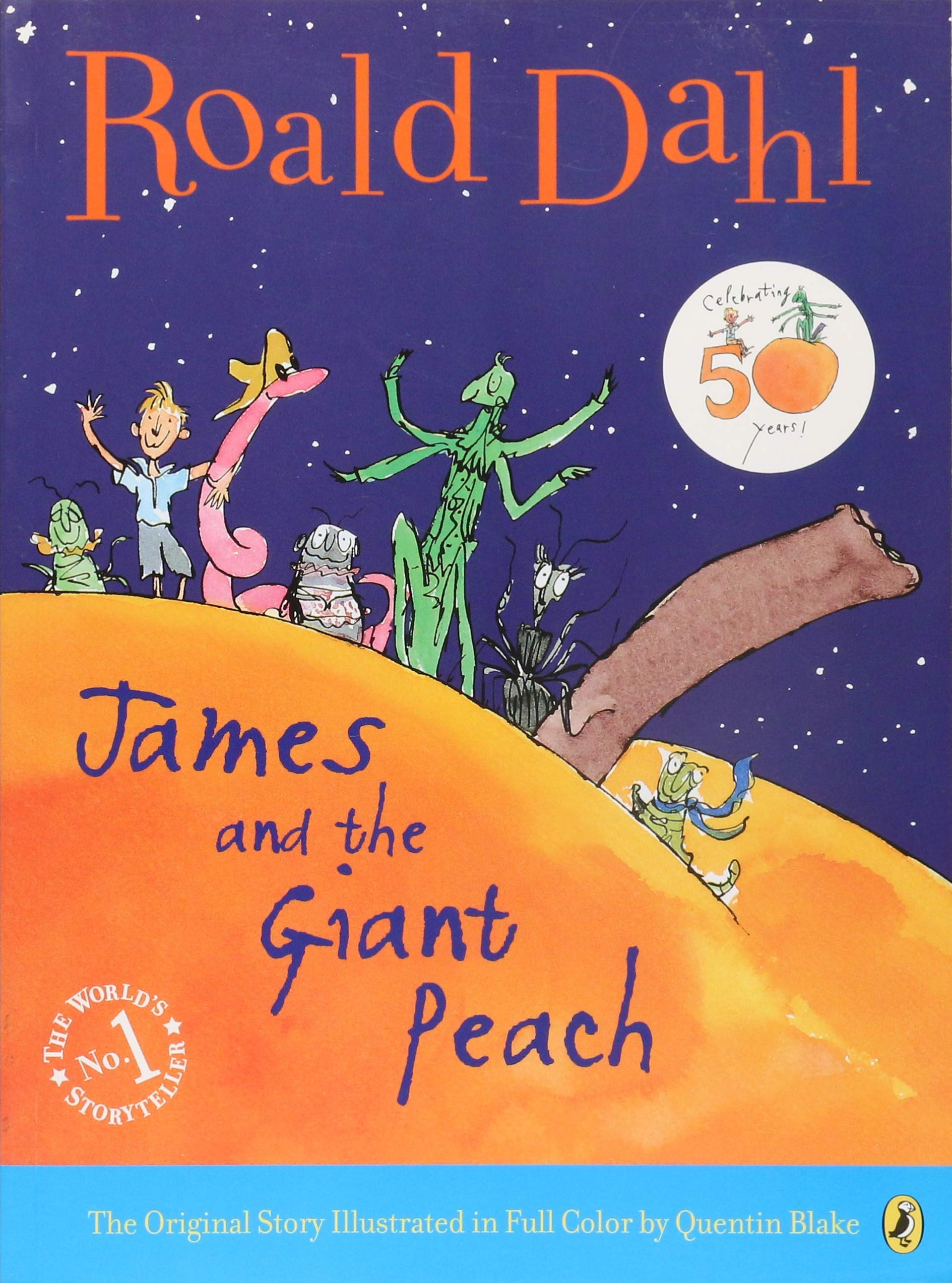
This is the most recognizable cover, illustrated by Quentin Blake, who creates most Roald Dahl book covers. This cover shows the scale of the peach, and all of the main characters of the story (James, the insects). The dark sky contrasts with the bright colours of the peach, which in turn makes the varied colours of the characters stand out.
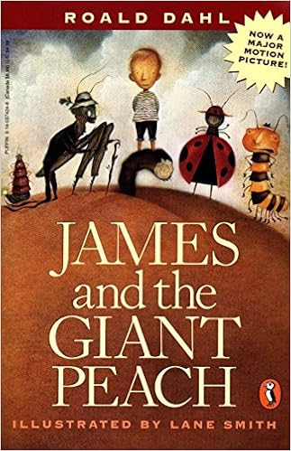
This cover (illustrated by Lane Smith) is made after the movie’s production. This is apparent as the characters in the cover maintain the same style as that seen in the movie. The peach appears photorealistic, along with the sky and the rest of the scenery. The colours are more diluted, showing a less vibrant and more macabre style, matching certain scenes within the book.

This cover uses silhouettes and gradients, along with only 2 distinct colours, orange (like the peach) and black. The characters are only silhouettes, leaving their actual appearance to the reader’s imagination. The tree on the back is a reference to the tree the peach grew from, and frames the back of the book effectively as it works as an L-shaped frame.
I plan on using orange in my book cover, as that is symbolic of the peach, and the sun, which I intend to have present in my cover. I also intend to use blue, as that is a complentary colour to orange, and represents night. As this book has a fair bit of time passage, and shows the flow of adventure, I believe using it would help summarize the book in cover form.

In evaluation:
I enjoy the colours I used, as warm oranges are part of the peach’s aesthetic and colour palette. The black silouettes of the peach, characters and birds stand out from the bright background, and the sense of wonder from the long shot camera angle is notable. I used the Spider and James in the cover, though I’d prefer all of the characters to be on the cover, but there wasn’t enough room on the peach to fit everyone. I’m also disatisfied with the seagulls; while they have a stylized and quite nice looking appearance, their stylization doesn’t fit the style of the cover itself. Also, I realized that one of the pieces of web doesn’t actually connect to a seagull, and it’s just floating there. I need to make sure the text is more visible on the bright background, too.
